Brand
Design language
The system behind this site: principles, tokens, and components, organized by atomic design. It's published three ways, for people and for agents.
- GuidePrinciples, voice, foundations, and every component from atoms to pages.Read the guide
- AssetsDesign tokens for both themes as JSON or ready-to-paste CSS variables.Download tokens
- MCP serverContext and tools so AI agents can build with this design system.Connect an agent
Principles
What the system is for
AI, with guardrails
I build with LLMs and agents every day, and I design for the moment they're wrong: drafts instead of decisions, approvals that show what will change, and an off switch. Sandcastle and Vibr are where I practice it.
Systems over screens
Design tokens, primitives, and patterns multiply velocity. Octuple grew from zero to 10,000+ touchpoints in eight months because the system carried the weight.
Deep engineering, in service of design
I prototype and ship in the real stack: TypeScript and React on the front end, Go and Node services and REST/GraphQL APIs behind them. Code is how I test a design against reality before anyone builds it twice.
Figma to shipped, in one head
Figma for systems, specs, and exploration; the full Adobe ecosystem and GenAI pipelines for editorial, motion, and creative; the codebase for the result. The handoffs people normally chain together happen inside one workflow.
Design as a team habit
In 2024 I started Pulumi's weekly UX critique and design team meeting, and both still run. Research starts with internal stakeholders, moves to support and sales, then to customer calls, and I work the findings through with engineers and product managers.
Hard, ambiguous problems
I'm at my best where design, engineering, and product strategy have to move together, in the seams nobody else has time for.
Voice
- Specific and outcome-led: name the system, the decision, and the measurable result.
- Sentence case for headings and UI.
- No em dashes in copy. Use a comma, colon, or parentheses.
- Lead with the reader's problem, then the evidence.
- Never state years of experience; let the work show range.
Accessibility floor
- WCAG AA is the floor: every text/background token pair is checked at build time (4.5:1).
- Every interactive element keeps the 2px section-accent focus ring on :focus-visible.
- Touch targets are at least 44×44 for persistent controls.
- Meaningful alt text on every content image; decorative images use alt="".
- All motion respects prefers-reduced-motion.
- Light and dark are both first-class; check every surface in each.
Foundations
Color
Surfaces, text, and one accent per section. Every text pair is checked at build time to meet WCAG AA (4.5:1) in both themes. Each ratio is measured against what the color sits on: text and accents against the page, surfaces against text, and accent-fg against an accent fill.
light theme
--bg
#fafaf9 · 19.0:1
Page background.
--bg-elevated
#ffffff · 19.8:1
Cards, tiles, pills, and anything that sits on the page.
--fg
#0a0a0a · 19.0:1
Primary text and icons.
--fg-muted
#525252 · 7.5:1
Secondary text: meta, captions, eyebrows, descriptions.
--border
#e5e5e5 · 1.2:1
Hairlines, card outlines, dividers.
--accent-home
#0a0a0a · 19.0:1
Home section accent (ink).
--accent-work
#3a3d98 · 8.7:1
Work section accent (indigo).
--accent-writing
#0f766e · 5.2:1
Writing section accent (teal).
--accent-about
#c01a30 · 5.9:1
About section accent (red).
--accent-brand
#b65825 · 4.6:1
Brand section accent (Beneficialmedia orange, AA-safe in both themes).
--accent-fg
#ffffff · 9.1:1
Text and icons on an accent fill.
dark theme
--bg
#0a0a0a · 19.0:1
Page background.
--bg-elevated
#161616 · 17.3:1
Cards, tiles, pills, and anything that sits on the page.
--fg
#fafafa · 19.0:1
Primary text and icons.
--fg-muted
#a3a3a3 · 7.8:1
Secondary text: meta, captions, eyebrows, descriptions.
--border
#262626 · 1.3:1
Hairlines, card outlines, dividers.
--accent-home
#fafafa · 19.0:1
Home section accent (ink).
--accent-work
#818cf8 · 6.6:1
Work section accent (indigo).
--accent-writing
#5eead4 · 13.4:1
Writing section accent (teal).
--accent-about
#f87171 · 7.2:1
About section accent (red).
--accent-brand
#d7733c · 6.0:1
Brand section accent (Beneficialmedia orange, AA-safe in both themes).
--accent-fg
#0a0a0a · 6.6:1
Text and icons on an accent fill.
Foundations
Typography
Source Sans 3 for display and headings; Jost for body and UI. Each row below is rendered in its real style.
display
Aa
Source Sans 3
Weights 400, 600, 700
Headings and display type. Bold (700), tracking -0.015em.
body
Aa
Jost
Weights 400, 500, 600
Body copy and UI. Futura-inspired geometric voice carried from the 2020 site.
display
Source Sans 3 · clamp(2.75rem, 6vw + 1rem, 6rem)
Home hero only.
Systems, shipped.page-title
Source Sans 3 · 2.25rem → 3.75rem at md
One per page: About, Work, case studies, tailored routes.
Design languageessay-title
Source Sans 3 · 2.25rem → 3rem at md
Essay headers.
Brand Is a Systemsection-title
Source Sans 3 · 1.875rem → 2.25rem at md
Section headings within a page.
How I approach the workcard-title
Source Sans 3 · 1.25rem–1.5rem
Work cards, timeline entries, essay rows.
Pulumilead
Jost · 1.125rem
Intro paragraph under a page title.
AI-native product design, from Figma to shipped code.body
Jost · 1rem
Prose. Measure about 720px (65–80 characters).
A brand is a system, and a design system is the brand in executable form.small
Jost · 0.875rem
Pills, card summaries, captions in the viewer.
Cover letter · Résumé · Get in toucheyebrow
Jost · 0.75rem
Labels above titles (e.g. EDUCATION).
Educationmeta
Jost · 0.75rem
Dates, ranges, gallery captions.
Jul 2024 – Presentmenu
Source Sans 3 · clamp(2.5rem, 8vw, 5rem)
Primary navigation items in the full-screen menu.
Work
Foundations
Space, shape, and motion
Radius
card
14px
tile
6px
pill
full
Layout
- container-page: max 1280px with a fluid gutter of clamp(1.25rem, 4vw, 3rem).
- Prose holds a 720px measure (about 65 to 80 characters per line).
- Sections are 6rem apart; elements within a section are 3rem apart.
- One page title (h1) per page; an eyebrow above each section title.
Motion
cubic-bezier(0.19, 1, 0.22, 1)
- Fade up 8px over 400ms on every route change (app/template.tsx).
- Cards fade up 24px over 600ms when scrolled into view, staggered 80ms.
- prefers-reduced-motion collapses all animation and transition durations to ~0.
Components
Atoms
The smallest pieces that carry the brand: labels, pills, icon buttons, links.
Eyebrow
eyebrow
A small uppercase label that names the section above a title.
Where I trained
Use: One per section, directly above its title. Never as a standalone heading.
Accessibility: Decorative context only; the real heading is the h1/h2 below it.
text-xs uppercase tracking-[0.22em] text-[var(--fg-muted)]app/about/page.tsxMeta line
meta
Dates, ranges, and read times in tracked uppercase.
Oct 17, 2026 · 7 min read
Use: Above card and timeline titles. Keep to one line; split onto rows rather than wrapping mid-phrase.
text-xs uppercase tracking-[0.18em] text-[var(--fg-muted)] whitespace-nowrapcomponents/Timeline.tsxPill button, primary
pill-primary
The one main action on a view, filled with the section accent.
View résuméUse: At most one per view (e.g. Résumé on a tailored route).
Anatomy: optional 14px icon · label (sentence case)
Accessibility: accent-fg on every accent is ≥ 4.5:1 in both themes (checked at build).
inline-flex items-center gap-2 rounded-full bg-[var(--section-accent)] px-4 py-2 text-sm font-medium text-[var(--accent-fg)] transition-opacity hover:opacity-90app/for/[slug]/page.tsxPill button, secondary
pill-secondary
Supporting actions next to a primary pill.
Get in touchUse: Cover letter, email, print. Hover borrows the section accent.
inline-flex items-center gap-2 rounded-full border border-[var(--border)] bg-[var(--bg-elevated)] px-4 py-2 text-sm font-medium transition-colors hover:border-[var(--section-accent)] hover:text-[var(--section-accent)]app/for/[slug]/page.tsxStatus badge
status-badge
A pill with a live dot that signals availability.
Available for workUse: Hero only.
Accessibility: The ping animation stops under prefers-reduced-motion.
inline-flex items-center gap-2 rounded-full border border-[var(--border)] bg-[var(--bg-elevated)] px-3 py-1 text-xs font-medium uppercase tracking-wider text-[var(--fg-muted)]components/Hero.tsxText link
text-link
An inline action in the section accent, with a trailing arrow.
See case study →Use: "See case study →", "All essays". Underline on hover.
text-sm font-medium text-[var(--section-accent)] hover:underlinecomponents/Timeline.tsxFocus ring
focus-ring
A 2px section-accent outline on every focusable element.
Focused controlUse: Global (app/globals.css). Never remove it without a replacement.
*:focus-visible { outline: 2px solid var(--section-accent); outline-offset: 3px; border-radius: 2px }app/globals.css
Components
Molecules
Atoms combined into one job: a card, a tile, a timeline entry.
Work card
work-card
A case-study card: logo poster, date range, company, role, summary.
Use: Work grids on Home, /work, and tailored routes. Most relevant first.
Anatomy: poster (logo on brand tint, 16:10) · meta line · company (card-title) · role · summary · arrow affordance
Accessibility: Whole card is one link with an aria-label; the logo loads eagerly so it's ready as the card fades in.
components/WorkCard.tsxQuick actions
quick-actions
Icon buttons stacked under the menu trigger on every page: résumé, contact, theme.
Use: Site-wide, so the essentials are always one tap away. The résumé button opens the tailored résumé for visitors who arrived through an opportunity route. Each shows its label on hover and focus.
Anatomy: icon button ×3 (0.5rem gap): a row beside the menu trigger on phones, a column under it from md · hover/focus label below (phones) or to the left
Accessibility: Each button has an aria-label; the visible label is aria-hidden to avoid double announcement.
components/QuickActions.tsxSee it live →Gallery tile
gallery-tile
A clickable thumbnail that opens the image viewer.
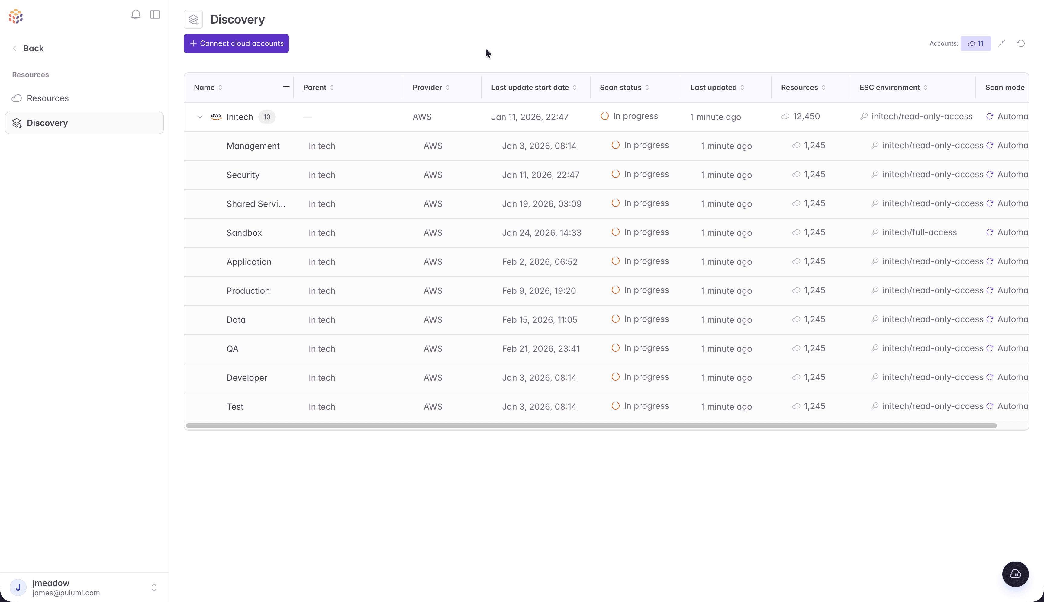
Use: Square tiles for mixed media; "wide" 16:10 tiles for product UI screenshots.
Accessibility: A <button> with "View image N of M: alt".
rounded-md bg-[var(--bg-elevated)] ring-1 ring-[var(--border)] hover:ring-[var(--section-accent)] cursor-zoom-incomponents/Gallery.tsxTimeline entry
timeline-entry
One role on the About timeline: accent dot, dates, company, role, summary, case-study link.
Feb 2022 – Jul 2024
Eightfold
Lead UX Engineer
Use: Reverse-chronological. Age-proofed: roles that ended 15+ years ago are left out; real dates are never altered.
components/Timeline.tsxEducation card
education-card
School and credential on an elevated card, without years.
Harvard Extension School
Master's, Computer Software Engineering
Use: "Where I trained" on About.
rounded-[var(--radius-card)] border border-[var(--border)] bg-[var(--bg-elevated)] p-6components/Education.tsxEssay row
essay-row
A listing row: date and read time on two rows, title, subtitle, arrow.
October 17, 20267 min read
Brand Is a System
Use: /writing and Home's latest essays.
app/writing/page.tsx

Components
Organisms
Self-contained sections: the menu, the hero, the gallery and its viewer.
Hero
hero
Status badge, display headline, lead, and actions on the home page.
Use: Home only. The one place display type appears.
components/Hero.tsxSee it live →Fractal vine
fractal-vine
A generative, seeded branching vine behind the home hero, grown from the brand's sprouting-vine motif: faint ink stems, sparse brand-orange leaves.
Use: Home hero only. Fades out toward the headline and at the bottom so text contrast is untouched. Regenerate with npm run generate:vine.
Accessibility: aria-hidden and pointer-events none; the one-time fade is removed under prefers-reduced-motion.
Two static SVG masks (vine-branches.svg, vine-leaves.svg) painted with bg-[var(--fg)] at 13% and bg-[var(--accent-brand)] at 30%; no JS, nothing added to HTML.components/FractalVine.tsx, scripts/generate-fractal-vine.mjsSee it live →Gallery and viewer
gallery
A tile grid plus a full-screen native <dialog> viewer with captions, arrows, and swipe.
Use: Case studies. Every image is self-hosted at native resolution and preloaded at idle, so the viewer opens from cache.
Accessibility: Native dialog: focus trap, Esc, focus returns to the tile; images are never upscaled past their source.
components/Gallery.tsxSee it live →Résumé document
resume-document
The résumé as data-driven sections (Summary, Experience, Education, Skills) with print styles.
Use: /resume and every tailored résumé. Tailoring may select, reorder, or omit; it can never reword a bullet.
Accessibility: Text-based PDF export with standard headings, so ATS parsers can read it.
components/resume/Resume.tsxSee it live →
Components
Templates
Page layouts that organisms slot into, independent of content.
Case study
case-study
Header (dates, company, role, summary, logo) → MDX story + highlights → galleries → next case study.
Use: content/work/<slug>.mdx
app/work/[slug]/page.tsxSee it live →Essay
essay
Meta line, title, subtitle, divider, then MDX prose at a 720px measure.
Use: content/writing/<slug>.mdx
app/writing/[slug]/page.tsxSee it live →Tailored route
tailored-route
A pitch for one company: headline, primary and secondary pills, pitch, most relevant work. Unlisted (noindex).
Use: content/opportunities/<slug>/ → /for/<slug>, /resume, /cover-letter
app/for/[slug]/page.tsxSee it live →
Components
Pages
Templates filled with real content: what visitors actually see.
Home
home
Hero, selected work, latest essays.
Use: /
app/page.tsxSee it live →Work
work
All case studies, reverse-chronological.
Use: /work
app/work/page.tsxSee it live →Writing
writing
Essays.
Use: /writing
app/writing/page.tsxSee it live →About
about
Principles, tools, timeline, where I trained.
Use: /about
app/about/page.tsxSee it live →Brand
brand
This design system: guide, assets, and MCP server.
Use: /brand
app/brand/page.tsxSee it live →
MCP server
Build with this system from any agent
A public, read-only Model Context Protocol server. Agents get the same tokens, components, and guidelines as this page, so what they build matches the brand. No account or key needed.
Endpoint
https://www.beneficialmedia.com/api/mcpStreamable HTTP · stateless · read-only
Tools
- get_design_tokens
- Color (light and dark), type, radius, space, motion, focus. JSON with roles, or CSS variables.
- list_components
- The catalog by atomic level: atoms → pages.
- get_component
- One component: when to use it, anatomy, Tailwind recipe, accessibility, source.
- get_guidelines
- Principles, voice, accessibility, layout, imagery, motion.
Claude Code
claude mcp add --transport http beneficialmedia https://www.beneficialmedia.com/api/mcpCursor, Windsurf, VS Code, and other HTTP clients
{
  "mcpServers": {
    "beneficialmedia": { "url": "https://www.beneficialmedia.com/api/mcp" }
  }
}
Clients that only support stdio
{
  "mcpServers": {
    "beneficialmedia": {
      "command": "npx",
      "args": ["-y", "mcp-remote", "https://www.beneficialmedia.com/api/mcp"]
    }
  }
}
Assets
Downloads
Generated from the same source as this page and the MCP server, so they never drift.
Beneficialmedia portfolio design system v1.0.0 · beneficialmedia.com/brand